
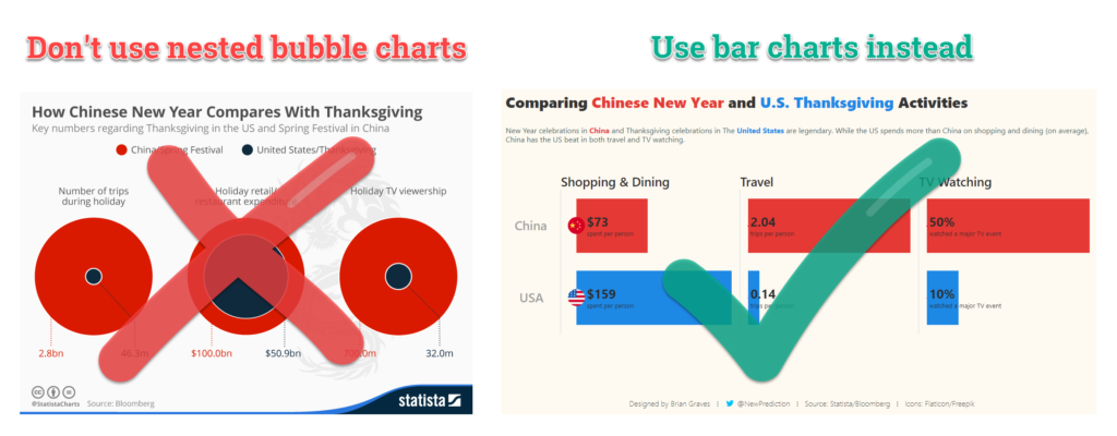
Nested bubble charts are a bad way to compare data. In this guide, I show how simple bar charts are a better option and rebuild a less than stellar data viz along the way.
The fine folks at Statista put together a data visualization to show how spending compares between major holidays in China and in the US.
However:
There were a few issues with the original chart.
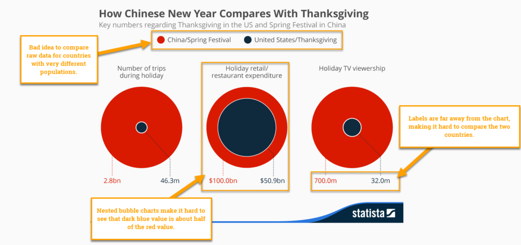
This data visualization is busted.
- China and United States have very different populations. You can’t really compare facts about these countries without considering that
- The nested bubble charts make it really hard to compare data points between the two countries.
- The labels are kinda far away from the charts themselves. So, readers have to look at the chart, then at the label, and then back to the chart. Too much thinking!
Here’s how to fix it.
- Include population data for each country in the visualization.
- Ditch the nested bubble charts in favor of simple bar charts.
- Put the labels as close as possible to the chart.
In this guide, I’ll take you through the entire process to fix this bar chart using the data provided by the MakeoverMonday team, Andy and Eva.
Quick links to each step in this guide
- Connect to the data
- Create a few calculated fields
- Build the bar charts
- Formatting and clean up
- Build the dashboard
Step 1: Connect to the data
The first thing you need to do is grab the data for this tutorial.
It’s hosted over on data.world and you can connect using the builtin web data connector.
https://tableau.data.world/?dataset_name=makeovermonday%2F2019w6
Just paste that URL into the Web Data Connector screen and you’re ready to create some calculated fields to fix the original chart.
Step 2: Create the calculated fields
Next, we’re going to create 6 calculated fields to fix this chart:
Below are each of the calculated fields and the code you need for each one.
1) 2015 Population
case [Country]
when "USA" then 321000000
when "China" then 1371000000
end
2) N Amt
//Amounts normalized by the population of each country
[Amount]/[2015 Population]
3) N Amt Formatted
//normalized amounts with formatting for each data type
case [Unit]
when 'people' then ROUND([N Amt],1)
when 'Trips' then ROUND([N Amt],2)
when 'US$' then ROUND([N Amt])
when 'viewers' then ROUND([N Amt],1)*100
END
4) Label with Amts and Units
//label formatting
Case [Unit]
when 'Trips' then LEFT(STR([N Amt Formatted]),4)+" "+'trips per person'
when 'people' then STR([N Amt Formatted])+" "+'people'
when 'viewers' then STR([N Amt Formatted])+"% "+'watched a major TV event'
when 'US$' then '$'+STR([N Amt Formatted])+" spent per person"
else [Unit]
END
5) Label with Amts Only
//label formatting
Case [Unit]
when 'Trips' then LEFT(STR([N Amt Formatted]),4)
when 'people' then STR([N Amt Formatted])
when 'viewers' then STR([N Amt Formatted])+"%"
when 'US$' then '$'+STR([N Amt Formatted])
else [Unit]
END
6) Label with Units Only
//label formatting
Case [Unit]when 'Trips' then 'trips per person'
when 'people' then 'people'
when 'viewers' then 'watched a major TV event'
when 'US$' then 'spent per person'
else [Unit]
END
Step 3: Build the bar charts
Once that is finished…
Simply drag each of the fields below to build the bar charts.
- Drag
[Category]to the columns shelf - Drag
[Country]to the rows shelf - Drag
[N Amt]to the columns shelf - Adjust the colors and sizing as needed
Step 4: Format your visualization
The next step is to adjust the way your visualization looks.
Here’s the thing
This part can take quite a while depending on how much effort you want to put in.
For me, I think it’s important. So I spend more time on this then others might.
You do you. 🙂
Here’s the steps I took to format my bar charts
- Relabeled each of the categories and countries to be more reader friendly
- Adjusted the colors to match the original visualization, with some slight tweaks to improve readability
- Made the bar charts wider to give more room for the labels
- Adjusted the axis to be independent and then hidden
- Increased the font sizes
- Added relevant labels with formatting and alignment settings
- Removed extra grid lines and axis markers that I found distracting
Step 5: Build the dashboard
Okay, the last step is to build the actual dashboard.
REMINDER:
Tableau makes this super easy if you know what you’re doing 🙂
- Create a new dashboard sheet in the workbook
- Drag your bar charts worksheet onto the dashboard canvas
- Add a horizontal divider and text box object at the top of that worksheet container
- Add your text into the text box as a title and format as needed.
- Create a new text box and add a description below the title
- Format the dashboard background, legends, and fonts for a clean look
- Include any footnotes, disclaimers, or other context at the bottom of your dashboard
Conclusion
In this step-by-step Tableau tutorial you learned
- Why you shouldn’t use nested bubble charts to compare two data points
- What to use instead of nested bubble charts (hint: use bar charts 😜 )
- How to rebuild a busted chart in Tableau