Today, I’m going to share the exact framework you can use to write about your data portfolio projects – even if you don’t know what to say.
When interviewing for data analytics jobs, having an awesome online portfolio will set you apart from the crowd.
Recruiters want to hire the best person for the role. And having a crystal clear write-up for each of your portfolio projects puts you at the top of the list.
Unfortunately, most beginner data analysts don’t realize the power of writing and miss out on the benefits.
Writing well about your projects has long-term benefits:
- Strengthens your ability to think through a problem
- Shows you can structure a project from start to finish
- Gives you the confidence to explain projects with ease
- Demonstrates your expertise more quickly than talking alone
Fortunately, there’s a way to crack the code on your project write-ups so that you never have to stare at the blank page again.
It’s called the STAR Method – let’s dive in:
The STAR Method breaks down your portfolio project into 4 parts: situation, task, action, and result.
- Situation: give some background on the project.
- Task: what needed to be done
- Action: what did you do
- Result: what was the outcome
You only need 1-2 sentences for each part. You do NOT need to be long-winded or go into extreme detail. Recruiters and hiring managers are much more interested in HOW you think than specific formulas, calculations, or functions.
Short is good. But short and specific is even better.
Let’s dive into each part:
SITUATION
In the first part, you set the stage for your project.
Give some context around the business problem or challenge that your project solves. Spend the least amount of time on this part, because it’s not directly applicable to the employer.
Be as specific as you can be with the situation by giving 1 or 2 background facts about the situation.
Bad: “I used the New York City bike rental data to create a regression analysis”
Good: “New York City has built a bike rental system that spans the 5 boroughs. But keeping track of bike usage and capacity is a challenge for the city.”
TASK
Here’s where you expand on the situation to fill in the gaps.
Describe the problem in more detail while making sure to stay in the context of the Situation and set up for parts coming up. This can be a bit longer, but still should be fairly short.
Bad: “The bike rental data came in CSV format with one row for each rental event.”
Good: “The bike rental tracking data was available but it was difficult to understand usage trends by location across the city, times of day, and any mechanical issues that happened with the bikes.”
ACTION
This part is where you get to shine.
Explain the specific steps with technical details that you took to solve the problem or overcome the challenge. This part will be the most in-depth and is a chance to show of your technical skills.
Keep your audience in mind. Don’t overshare super-specific implementation details.
For example, if your project required a SQL query, don’t give specific details on table names and columns you used.
Instead, mention broad topics that will apply to all data analytics roles like subqueries, CASE statements, CTEs, etc.
Bad: “Here’s a GitHub link to the SQL file I used.“
Good: “I created a data pipeline with Python and SQL to ingest the data into a SQLite database. I then used Tableau to produce an executive-level interactive dashboard to help decision-makers see and understand the data at-a-glance.“
RESULT
The final part of the STAR Method is where you wrap it up.
Answer questions like:
- What did you learn?
- Was there anything surprising?
- What was the final outcome of the project?
You’ll want to 2-3 sentences for this part and include any specific results from your work on the project. If possible, provide facts and figures that highlight the improvements your work brought.
Bad: “Here’s a link to the GitHub repo.“
Good: “As a result of the new executive dashboard, New York City Bike Rental leadership teams have the information they need at their fingertips. I used dashboard actions to provide interactivity and Level of Detail calculations to create KPIs to help inform the teams.“
Now that you understand the STAR Method, let’s look at an example from my personal data analytics portfolio.
Real-world Portfolio Write-Up Using The STAR Method
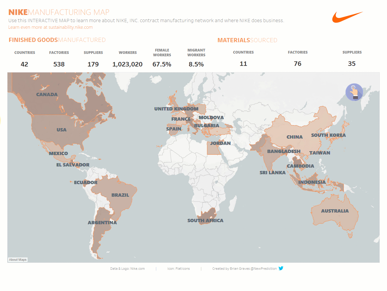
Interactive Nike Manufacturing map from my portfolio
SITUATION
Nike products are made all over the world by independent suppliers and one of their company goals is manufacturing sustainability.
TASK
Nike created a web-based map of Manufacturing Sustainability, but it requires a lot of clicking and has limited information at-a-glance. The goal of this project was to create a similar experience in Tableau but improve the user experience.
ACTION
I created an interactive Tableau dashboard to show both high-level information as well as supplier detail without having to click back and forth through various countries.
With the data set in hand, I processed the data and created an interactive Tableau map.
- Cleaned up country codes
- Created calculated fields using Level-of-Detail
- Designed interactive map with dashboard actions
- Used Viz-in-Tooltip for deeper insights without navigating away from the main map
RESULT
Through the project, I learned how to create an interactive map in Tableau and how to use the viz-in-tooltip feature in Tableau.
I also worked to gather feedback on the project and implemented some of the suggestions on formatting, UI, and interactivity for an improved overall user experience.
This redesigned dashboard provides at-a-glance supplier transparency for Nike executives and external stakeholders.
There you have it! A full data analytics portfolio project write-up that isn’t boring.
Remember, don’t actually put each of the STAR words in the write-up. 😅
Once you get the hang of it, the write-up part of your project will come easier. Another side benefit is that as you create more projects, you’ll have this framework in mind as you work.
By the end, you’ll have a well-structured write-up that can be used in:
- Your online data analytics portfolio
- In screening interviews with HR
- In technical and team-fit interviews with hiring managers
- On LinkedIn and other social media sites
That’s it!
| See you again next week! Whenever you’re ready, there are 2 ways I can help you: 1. How To Create An Awesome Online Data Analytics Portfolio Preorder today and get the full version when it’s complete. 2. Need specific advice? Book a 1:1 session with me. |
Pingback: The Step-by-Step Roadmap For Data Analysts to Get Started With Python for Performance Marketing Analytics – New Prediction
Wow, truly insightful Brian. I have been posting on LinkedIn about my portfolio projects but didn’t know the right procedure. This will help me heaps. Thanks!