
Today, I’m sharing 3 simple ways that data analysts can improve their writing – plus the resources needed to get you started.
Writing is foundational to the work you do as a data analyst. By improving your writing skills, you’ll be able to communicate with your coworkers, colleagues, and clients.
In this guide, I’ll take you through the specific areas that data analysts need to focus on first.
Unfortunately, most data analysts don’t really think writing well is important.
Your tech skills and professional skills aren’t enough to succeed in your career.
Many people think it’s hard to improve their writing:
- Don’t know where to start
- Procrastinate on learning to write well
- Focus on perfection instead of progress
- Confused about what’s good writing vs. bad writing
By the end of this guide, you’ll know exactly where to focus your writing skills in your data analytics projects.
Step 1: Headlines
Headlines are the most prominent written part of a data analyst report or dashboard.
It’s right at the top, and it’s the thing that people see first.
Unfortunately, many data analysts skip the headline altogether. But that’s a big mistake because it’s “prime real estate.” Imagine you bought a luxury storefront in downtown New York City.
- Would you cram garbage into every nook and cranny?
- Would you put cheap items next to expensive items?
- Would you distract shoppers from buying?
Of course not. But that’s what data analysts do every single time they create a report and neglect the headline.
How to write attention-grabbing headlines for your data analytics project:
- Create an early rough draft as soon as possible.
After you’ve analyzed the data a bit, you’ll start noticing a theme, trend, or something interesting. Jot down your initial ideas in a notebook or right in the analysis header. - Put your conclusions right in the headline.
Always choose a clear headline for your analysis instead of something clever. Your coworkers and your boss are busy. Don’t make them think about what your analysis is about. Just tell them straight up. - Use a sub-headline to provide extra context.
Sub-headlines are a great way to put additional background information into the headline without it being too long or wordy. - Add some formatting to drive your point home.
Use color, bold, or italics to highlight key points. Protip: match the colors of your report as a quick legend or reference for the end user. - Create the final headline.
Your final headline should be tight. No extra words. Straight to the point.
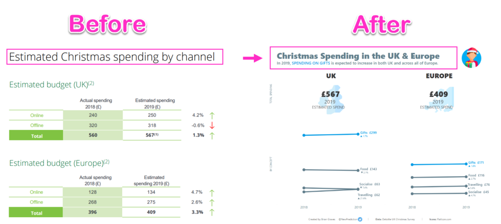
Here’s an example from my data analytics portfolio.
4 simple ways to improve your headline writing skills as a data analyst:
- Use sub-headlines to provide context
- Put your conclusions right in the headline
- Use formatting to draw attention where needed
- Always include a headline in your final reports or analytics projects
Step 2: Storytelling
Finding insights in the analysis is the first step in making data-driven decisions.
Your value, as a data analyst, comes when you are able to create a story that helps people take action.
A data story is something you create that puts context around your analytics project. It helps the end user understand why your project is important in the first place. A data story also includes insights based on your domain expertise and impact to business goals and objectives.
Fortunately, data storytelling is a skill that can be developed.
Here are the 8 steps to create a story with data
- Look for themes
- Consider your audience
- Determine what data matters
- Analyze the data and find insights
- Create an effective data visualization
- Provide context on broader business goals
- Create the first draft with the 4 main parts of the story
- Finalize the story until it’s clear, concise, and to the point
That might look like a long list, but you are probably doing some of these subconsciously anyways.
For example, think about if you review your monthly bank statements. That’s a form of data analytics and you are the “end user” here.
- You look for spending themes and any unexpected charges (items 1, 2, 3 and 4 above)
- If you really wanted to, you could create a report in Excel to visualize your expenses, determine if those expenses were in your spending goals, and get a clear picture of your personal finances in your mind (items 5-8 above)
See, it’s not as hard as it seems. And it’s what makes the difference between a standard analytics report and one that gets attention.
4 simple ways to improve your data storytelling skills as a data analyst
- Focus on the audience
- Set the right background
- Include who the analysis about
- Make sure you have a clear conclusion
Step 3: Copywriting
Copywriting is all about getting your ideas into someone else’s brain using words.
If you can’t get your point across in writing, you are at a serious disadvantage as a data analyst. Decisions are made every single day based on what is written down. And as a data analyst, you need to ensure that your reports and analysis are well-written.
Copywriting skills can be applied in the business world:
- Emails
- Status reports
- Funding requests
- Business proposals
- Reports and dashboards
- Slack or Teams messages
Most people link copywriting with sales and marketing in their minds. They don’t see how copywriting skills apply to their normal work. But think about it: you are basically selling your services to your boss or your clients each and every day.
Copywriting is all about getting your ideas into the right minds.
Here are tips to you can apply to your copywriting immediately.
- Know your audience
- Be specific and precise
- Have a strong call to action
- Avoid using technical jargon
- Use bullet points and short paragraphs
- Focus on being clear instead of being clever
That’s it!
Master these 3 writing skills to stand out from the crowd as a data analyst:
- Headlines
- Storytelling
- Copywriting
See you again next week!
Interested in starting with data?
Whenever you’re ready, there are 2 ways I can help you: