
Have you ever come across an idea with TONS of potential but fails to deliver on that potential? My friends Andy and Eva are pros at finding this stuff.
Let me explain…
They run a super cool project called MakeoverMonday.
Why is it so super cool? Because each and every week they find data visualizations from across the web, collect the underlying data sets, provide inspiration and feedback to the data viz community.
It’s a great way to connect with others and level up your data visualization game.
But, here’s the secret that most people don’t know.
By participating in MakeoverMonday, you get to fulfill the potential of that FAILED idea.
Super cool, right? How often at work do you see a crappy PowerPoint deck or poorly written email? How often do you get to make it better? Basically never.
Well, I’m going to pull back the curtain to show you how I fulfill the potential of a failed idea.
I dig into a super busted (and super boring…) chart from the World Health Organization looking at life expectancy rates across the globe.
While the original chart is definitely boring, the underlying story is definitely not boring.
In this case study you’ll learn:
- What I liked about the dashboard (and didn’t like)
- How I improved it
- The exact 14 steps + calculations you need to make your own smooth bump charts
BEFORE (the original dashboard)

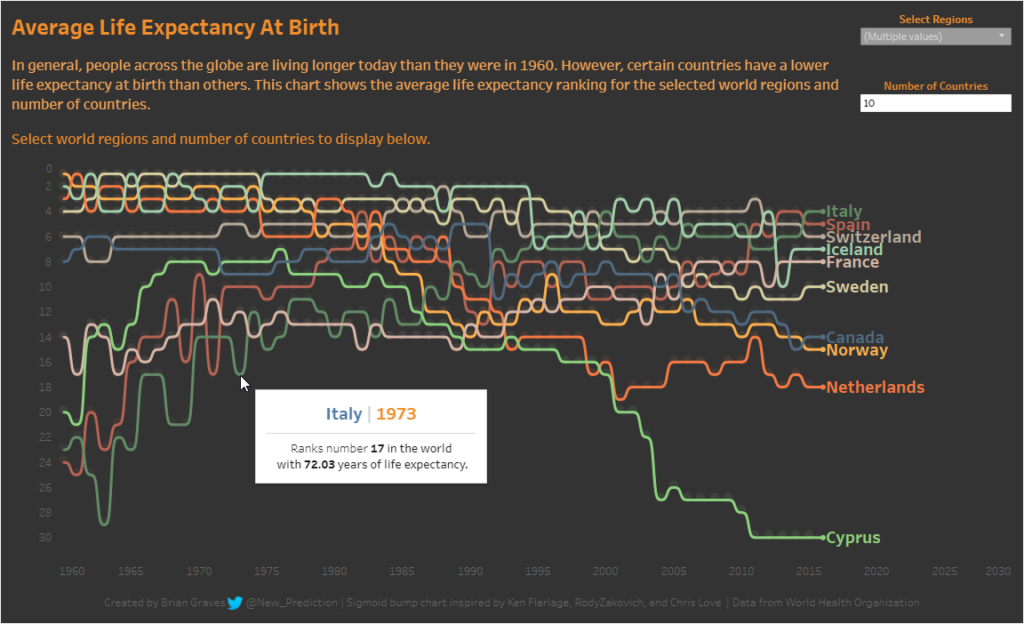
AFTER (my recreation)
4 things I really liked about the WHO Life Expectancy dashboard

- All countries are listed in alphabetical order in a table. This makes it easy if you’re need to find the life expectancy of a specific country at a glance.
- There are multiple views in one interactive dashboard. You can answer a few basic questions pretty easily.
- Color scheme is consistent for each view. No glaring issues with the color selection that might cause confusion.
- The legend provides exact value ranges with no overlap or confusion. The extra level of precision here is nice!
5 things that could be improved

- The interactivity didn’t work for me in the Google Chrome browser. Chrome is a very popular browser, so it’s kind of shocking to have something not work using that browser in 2017.
- There is no story or any highlights or anything here. It’s a pretty boring reference dashboard and doesn’t offer much for exploratory analysis.
- The dashboard has a lot of wasted space. For example, the table view could be removed completely if labels were added to the map or to the bar chart.
- The interactivity on this dashboard is pretty minimal and really just highlights the selected countries. It would be better to add some new information to highlight the similarities and differences between the countries selected.
- There seems to be a mismatch between the title of the dashboard and what’s actually being displayed. The title shows “2000-2015” so that’s what I thought was being displayed. However, the default selection is set to 2015 so that’s somewhat misleading. Also, the dates are in 5 year blocks so we don’t have data for every year so I think the title is misleading in that way, as well.
The exact ways I improved the WHO Life Expectancy dashboard

- Created a smooth bump chart in Tableau to show the change in ranking for each selected country over time. This is better than the bar chart because it includes the time and country dimensions and makes it easy to compare countries against each other.
- Added color coding to each country so it’s easy to keep track of changes over time.
- Included Tableau dashboard actions and parameters for improved interactivity and encourage exploratory analysis.
- Added tool-tips to keep some of the detail out of the main visualization, but still available on hover.
Rebuilding the original WHO Life Expectancy chart into an interactive Tableau dashboard (the step-by-step process)

- First, I downloaded the WHO Life Expectancy data in Excel (thanks again to the MakeoverMonday team!)
- Next, I explored the data to find any quick insights or potential problems with the data set.
I found there were some countries with missing data for certain years, multiple levels of detail, and aggregates all buried within the data set. - After identifying those issues, I created an Alteryx workflow to clean up the extra records and simplify the data. I also added a new column called Join with a value of 1, which will be used in the smooth bump chart.
- Then I started on the main part of the interactive Tableau dashboard: the bump chart.
It’s something I’ve seen and wanted to learn, plus I think it fits well here with the rankings over time.
Now, I didn’t want just a regular bump chart.
I wanted a super smooth bump chart.
Here’s the problem: I had NO CLUE how to build one!
Thankfully, there are a few folks that have done all of the heavy lifting (thanks Chris, Ken, and Rody!).
Here is the short version based on what I’ve learned.
How to create a smooth bump chart in Tableau
- Create a simple Excel sheet with 2 columns.
- Label one ‘Path’ and the other ‘Join’. Path has numbers 1-49. Join just has the number 1 repeated 49 times. You can download mine if you are confused like I was!

- Save the Excel file to your computer as “Join.xlsx”
- In Tableau, open your main data set. I’m using the WHO Life Expectancy data with my extra “Join” column tagged onto the end.
- Then, add a new data source and select your newly created Join.xlsx file
- Switch the join type to Outer and adjust the join column data types if needed.
- Create the 8 calculated fields needed for the smooth bump chart:
| Field Name | Calculation |
|---|---|
| t | ([Path]-25)/4 |
| Sigmoid | 1/(1+EXP(-[t])) |
| Rank 2 Setup | IF MIN([Path]) = 49 THEN LOOKUP(MIN([Rank]),1) END |
| Rank 2 | IFNULL(WINDOW_MIN([Rank 2 Setup]), MIN([Rank])) |
| Curve | MIN([Rank])+(([Rank 2] - MIN([Rank]))*MIN([Sigmoid])) |
| YearOrder | [Year] - {MIN([Year])} |
| PathOrder | (49*[YearOrder])+[Path] |
| Marker | FLOAT(MIN(IF [Path]=1 THEN [Rank] END)) |
Create the visualization
- Convert the Year field from a measure to a dimension
- Drag YearTemp to the Columns card
- Drag Curve and Marker to the Rows card and set as a dual axis
- Adjust the left and right axis so it’s reversed and showing 0 at the top position.
- Drag Region to the Filters card and select North America to reduce the number of countries displayed while we’re developing
- Drag Region and YearTemp to the Detail section of the Marks card
- Adjust the Curve Table Calculation, for both Rank 2 and Rank 2 Setup
- Compute Using: Specific Dimensions
- Order: Country Name > Year > Year Temp > Region
- Restarting Every: Year for Rank 2 and Country Name for Rank 2 Setup
Finish up
You can remove the filters, finish formatting, add some tool-tips, and build out more functionality as needed.
Recap
- How to analyze an existing dashboard and how to identify areas for improvement.
- Smooth bump charts are a great way to view changes in rankings over time.
- The 14 steps needed to make your own smooth bump chart in Tableau (including 8 calculated fields need)
Great post! Next blog should be about learning to use chopsticks.
Haha Andy!
Brian, this is cool. What are each of the calculations for? For example, does the path call create the line and the sigmoid create the bump?
Thanks for this resource!
Thanks Emily! Great question! Kinda hard to explain in text but you need lots of extra data points for each dimension to create the sigmoid curve. The curve is generated by the combo of points, the sigmoid function, and the “magic” t function. Perhaps I’ll add a video companion guide to the post here! 🙂
Yes!! Do it to it! So many of these things are cool but hard to understand why things are happening as they are. Copy and paste will only get you so far.
Pingback: Dashboard Week Day:4 - The Data School
Not sure if I missed something but is the formula for [Rank] missing?
Hey anon! [Rank] is just a column in the data set. It’s not a calculated field so there’s no formula. Thanks for asking!!
Is that possible to use a calculated field of [RANK]? I tried and the error showed cannot aggregate (Min ) of an aggregated field.
I had to rank the value outside of Tableau first. Advice?
Great question! I found the best method was to rank the value outside of Tableau as well. Let me know if you find a workaround!