
Imagine adding a single chart in your report or dashboard that shows details and context all in one.
What if you could show all of the required information but make the most important details super clear.
…highlight tables are a great way to do that exact thing.
In this guide, you’ll learn how to create this chart type, plus some advanced options.
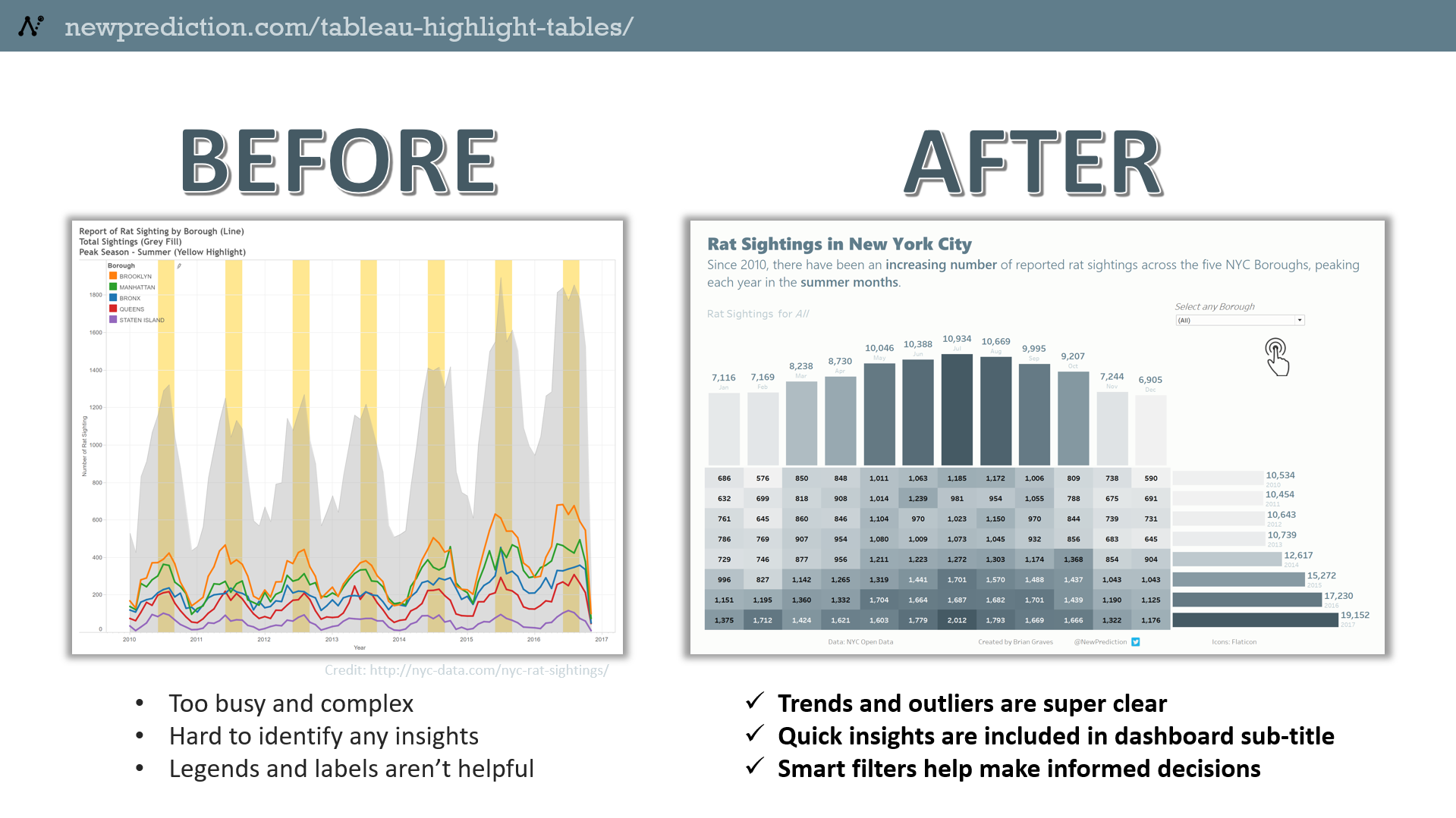
Tableau Highlight Table Examples
- Comparing sales numbers for your teams or individuals
- Showing GPAs across grade levels or subject areas for students
- Understanding changes in population sizes between towns or zip codes
Now – creating highlight tables in Tableau is actually incredibly easy. Just a few clicks, really.
But this guide goes much more in depth than just the basics.
I’ll show you the exact steps to recreate this exact Tableau dashboard.
Quick links for each of the parts for this step by step Tableau highlight table tutorial.
- Step 1: Connect to the data set
- Step 2: Create the highlight table
- Step 3: Create the top trend chart
- Step 4: Create the right-hand side trend chart
- Step 5: Create the final dashboard
By the way, these advanced highlight tables are sometimes called “marginal histogram charts” or even “heat maps”
Anyways, this guide will help you create a highlight table with multiple dimensions.
Step 1
Connect to the data set
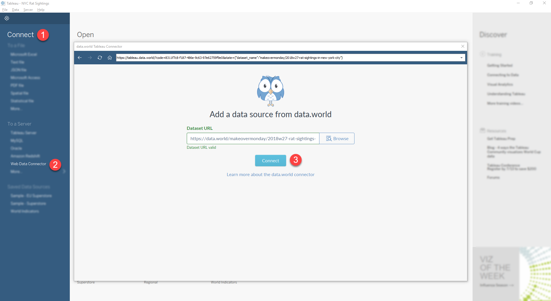
Note: If you already have a dataset in Tableau, skip to step 2
- Open a new Tableau workbook
- In the Connect section, select “Web Data Connector”
- When prompted, enter the NYC Rat Sightings URL (http://tableau.data.world/?dataset_name=makeovermonday/2018w27-rat-sightings-in-new-york-city&query=SELECT%20*%0AFROM%20rat_sightings&queryType=SQL)
- Follow the prompts to finish up the connection
Step 2
Create the highlight table
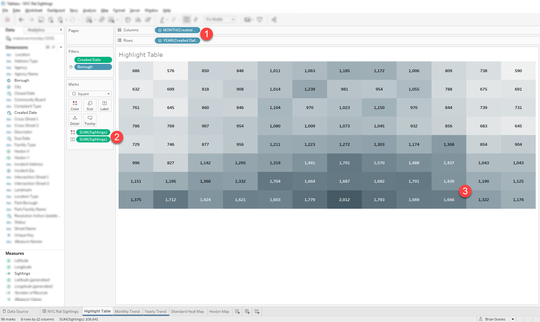
- Drag Month(Created Date) to Columns section
- Drag Year(Created Date) to Rows section
- Create a Sightings field and set the value to [Number of Records]
- Drag Sightings to the Color section and also the Label section of the Marks card
- Rename the worksheet to Highlight Table and finish up formatting, text, colors, labels as needed
Note: if you want just a basic highlight table, you can stop after step 2
Step 3
Create the top trend chart
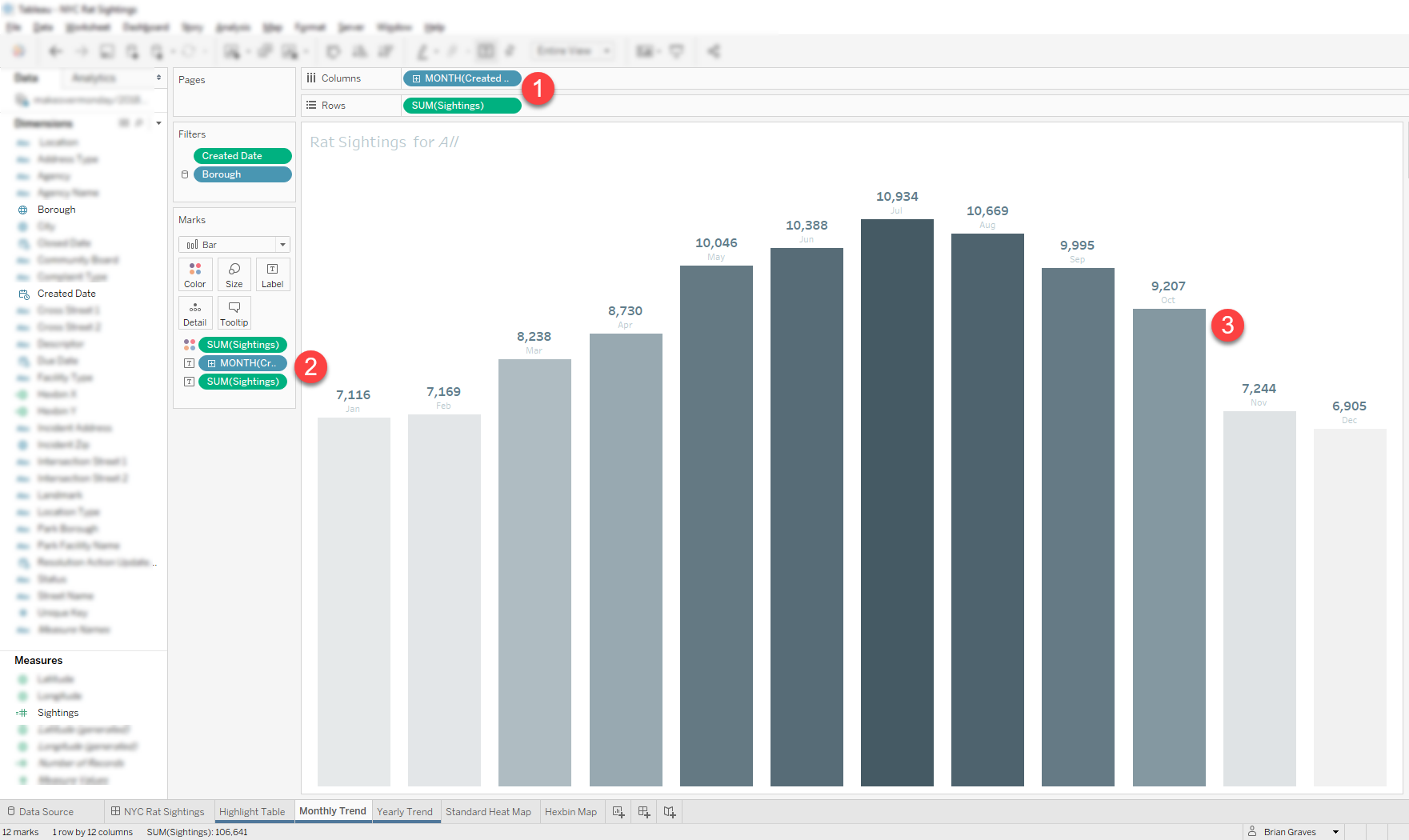
Time Saving Tip: Duplicate worksheets to keep field formatting and layout
- Duplicate the Highlight Table worksheet you just created
- Keep Month(Created Date) in the Columns section
- Remove Year(Created Date) from the Rows section
- Drag Sightings to the Rows section
- Drag Month(Created Date) to the Label section of the Marks card
- Rename the worksheet to Monthly Trend and finish up formatting, text, colors, labels as needed
Step 4
Create the right-hand side trend chart
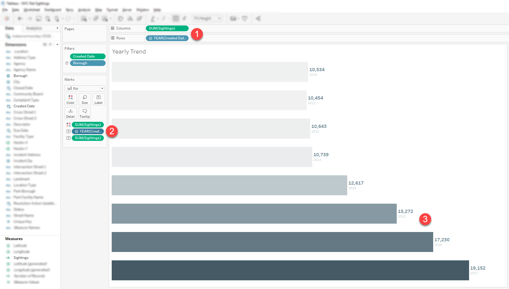
- Duplicate the Monthly Trend worksheet you just created
- Drag Sightings to the Columns section
- Drag Year(Created Date) to the Rows section
- Drag Year(Created Date) to the Label section of the Marks card
- Rename the worksheet to Yearly Trend and finish up formatting, text, colors, labels as needed
Step 5
Create the final dashboard
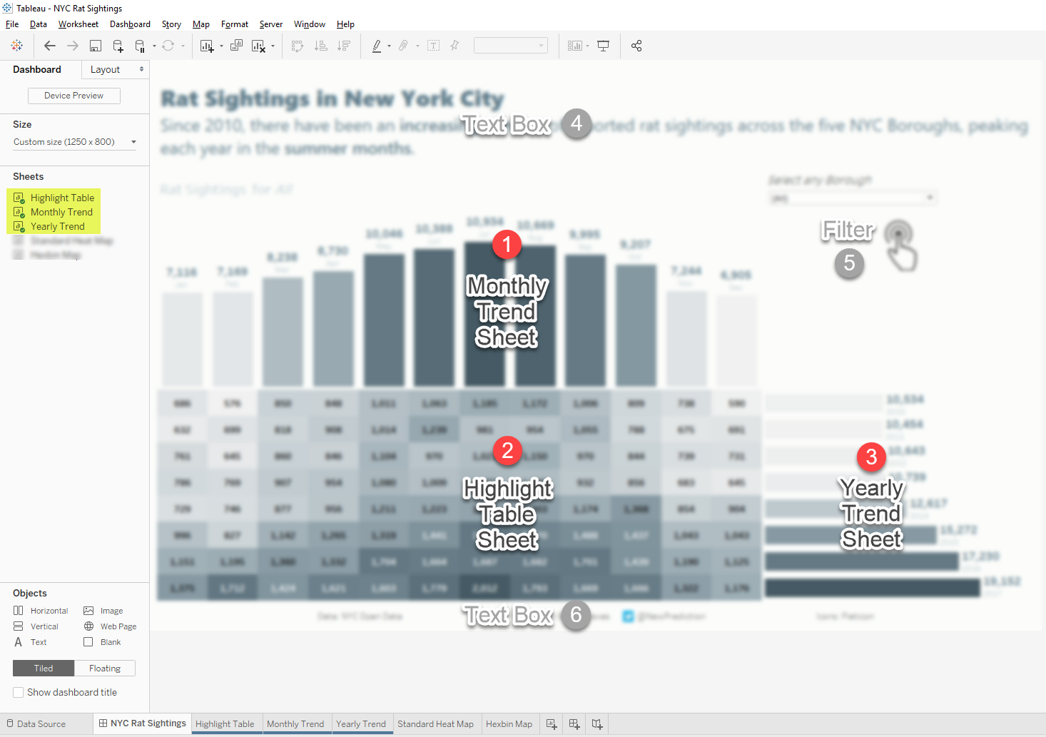
- Create a new Tableau dashboard
- Drag each of the worksheets you’ve created to the dashboard canvas
- Make sure that the Highlight table container aligns with each of the trending bar charts
- Rename the dashboard to NYC Rat Sightings and finish up formatting, text, colors, labels as needed
Bonus Step
Tableau Dashboard Tips & Tricks
Tips on Tableau dashboard formatting
- Focus on one design element at a time. For example, make sure that your colors are consistent for each worksheet.
- Once you’ve got your colors all set, move to grid lines and borders.
- Make sure that each of those is all set before moving on to labels, for example, for final formatting adjustment.
- Adjust the padding for each worksheet container for proper spacing.
- Remove any titles, legends, and other dashboard elements that aren’t needed
Final touches for your Tableau dashboard
- Adjust chart and dashboard dimensions so that everything fits on one screen.
- Add titles and subtitles so that it’s obvious what your dashboard is showing
- Include filters and hover highlights to make your dashboard as useful as possible
Final dashboard – Link to Tableau Public
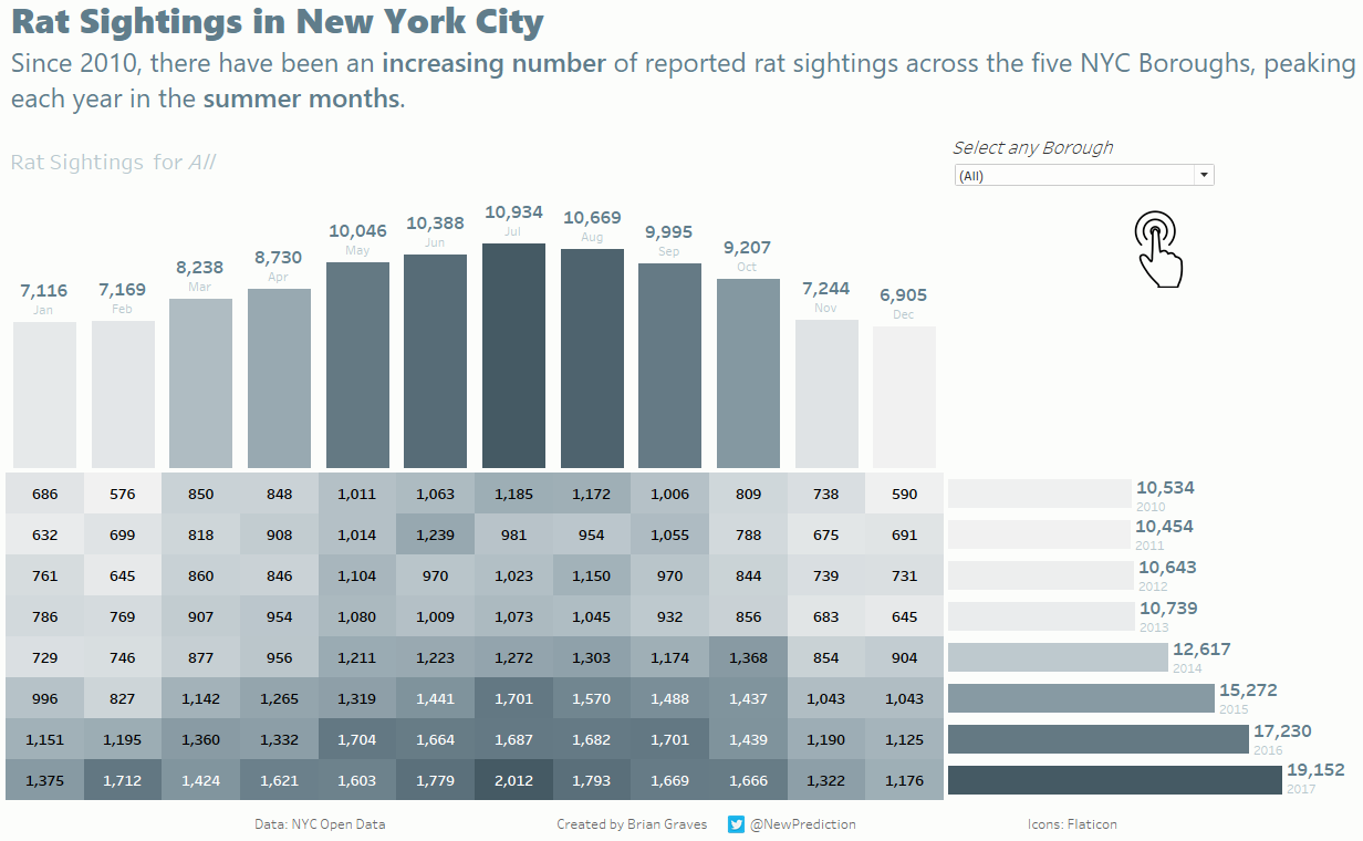
Tableau Highlight Tables Tutorial YouTube Walk through
Conclusion
In this step-by-step highlight table tutorial you learned
- Exactly how to create highlight tables using Tableau
- How to build more advanced highlight tables to make them even more powerful
- A few examples of how highlight tables can be used
- Everything needed to create an interactive Tableau dashboard that will impress your boss 🙂
Okay, now it’s your turn:
Take 20 minutes today and create a Tableau highlight table that you can share.